Strike Magazine

Redesigning an aesthetic and intuitive experience for an online creative publication
Strike Magazine is a creative culture magazine for college students with chapters across the United States. A few students at UConn were interested in starting a local chapter of the magazine, and I was recruited to be the Creative Director of the publication. When I took a look at the existing Strike website, I saw some opportunities for UX improvements.
In my interaction design course, we were given an open-ended final project, so I chose to create a new Strike Magazine website. The assignment required that I create both desktop and mobile experiences of the site, so I built out a home page, article page, category page, and interactive menus for each both experiences.

Establishing strategic alignment: matching design with platform content
As a publication in the creative space, it was important for the new UX to communicate the same values as platform. This meant designing a website that was clean, colorful, and most importantly, visual-heavy.
I began my research by assessing how larger publication websites were structured, how creative outlets and blogs communicated information, and looking for common threads between other creative publications.
Below are a few screen captures of the original Strike Magazine website.
Research + Prototyping


Emphasizing intuition in the design approach: reducing complexity, embracing minimalism, and thinking like a user
One of my biggest problems with the original Strike website was the navigation: the header menu contained way too many elements, and I knew these could be simplified into just a few categories. This would make it easier and more efficient for users to find what they need, as there would be less options to work through.
To remedy this issue, I analyzed the content that Strike writers were producing and derived common themes from their pieces. I was able to cut down the number of menu elements from seven to five, and provide more concise categories for users to navigate through.


The next step in the process was designing wireframes. In this project, it was important to maintain continuity between layouts on both the desktop and mobile versions. Additionally, I needed to make sure that I maximized the site’s accessibility on both devices. This meant that I had to design with different font sizes, image sizes, and layouts depending on the screen size.


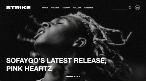
No boring landings
I designed an eye-catching carousel above the fold, a simple and intuitive nav, and a welcoming collection of curated content.
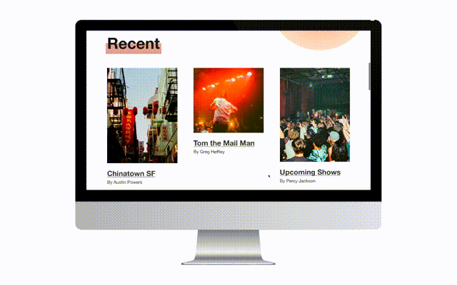
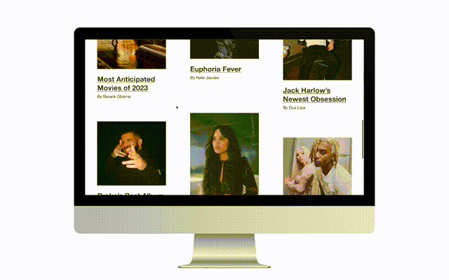
Read all about it
The next step in the process was designing wireframes. In this project, it was important to maintain continuity between layouts on both the desktop and mobile versions. Additionally, I needed to make sure that I maximized the site’s accessibility on both devices. This meant that I had to design with different font sizes, image sizes, and layouts depending on the screen size.
Exploring the past
At the bottom of the page, I added an interactive horizontal scrolling element that allowed users to explore the past/print editions of the publication.

Sort it out
The category page is home to all articles that belong under a common theme. I designed a few sub-category filters through which users can refine their readings to more relevant content.
Find your way
I added hover animations to the nav elements, which included a pink stripe highlight and text bolding. By making the nav visually engaging, users are more interested in looking around the site.


Read me…
In the article header, I included buttons for sharing via email and social media. I also added a category tag, which corresponds to the category page under which the article lives.
…and read more!
I added hover animations to a few of the images within the article. At the bottom, I included a container with related articles, encouraging users to further explore site content.
Want to play with the prototypes?
If you would like to interact with these designs, you can access the desktop and mobile versions on this project’s Behance page.
