Health Equity Map
When I was scrolling on Instagram, I saw this really interesting infographic that illustrated the power of geography. The graphic showed a map of rivers in the southern US, showing how the flow of water led to heavy ore deposits and more fertile farmland.
Over centuries, these valuable geographic locations became more populated, and aligned closely with enslaved population density (i.e. illustrating how slaves worked on plantations which needed fertile farmland). In the modern day, the impact of the rivers can be still seen in the African American population densities in the south.
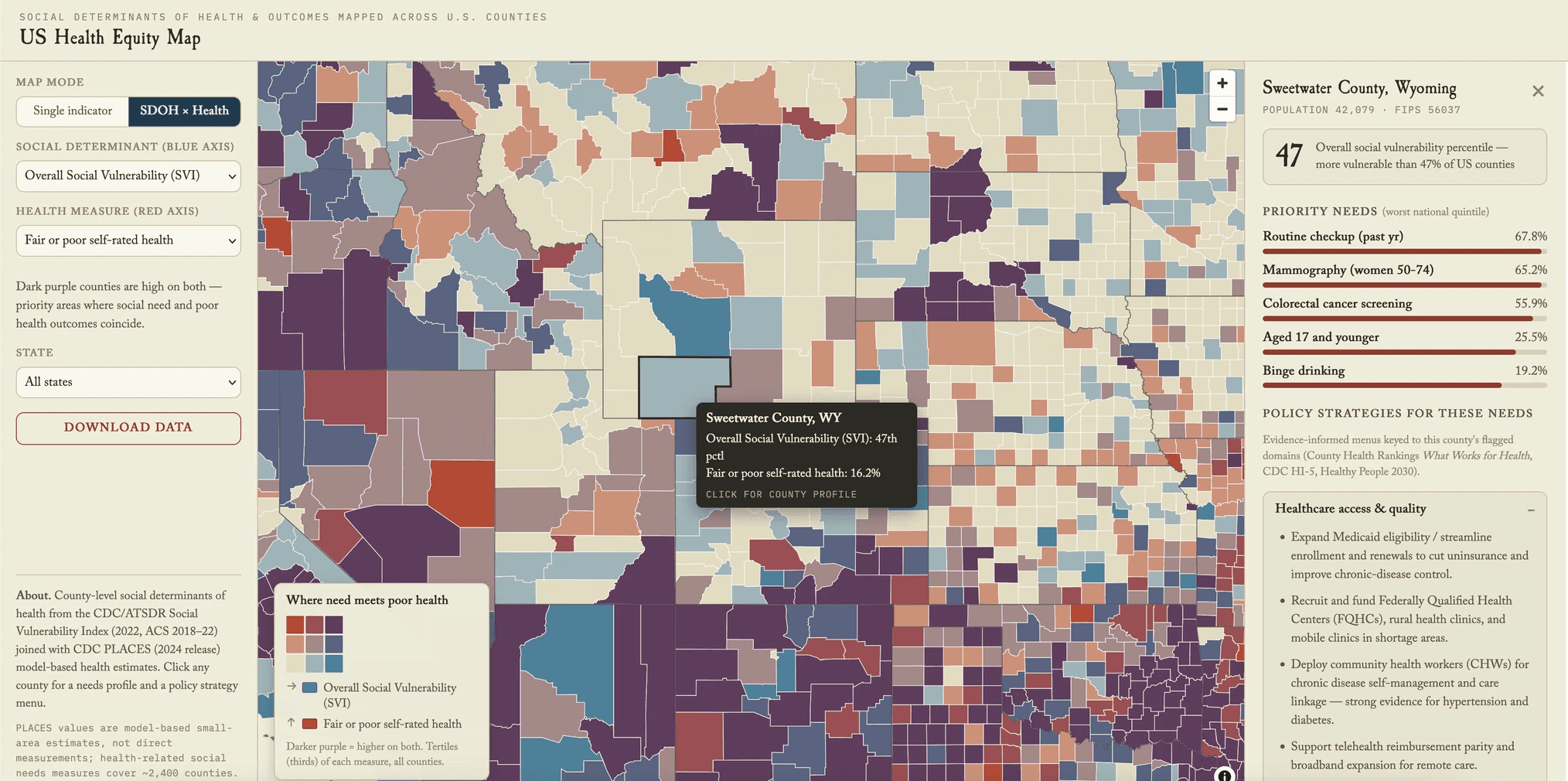
I wanted to design a map of my own that would illustrate how health appears across the geography of the US. I began by collecting data from the CDC's Social Vulnerability Index, PLACES health estimates, and Census data. I wanted to visualize this data in way that allowed people to see how health appears across the country.
Before writing any code, I put together a framework grounded in WHO's operational framework for monitoring social determinants of health (SDOH), the NIH's NIMHD research framework, and CDC guidance. I wanted to address the idea of intersectionality in health, and how race, gender, socioeconomic status, and geography compound rather than act independently.
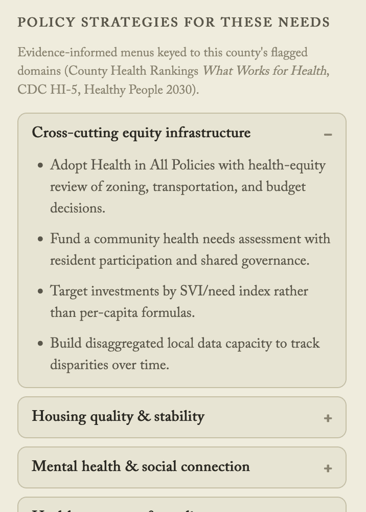
The goal was to create a tool that points toward where and what kind of intervention is actually needed for a healthier America, drawing on evidence-based policy menus (County Health Rankings, CDC HI-5, Healthy People 2030).


The hardest design problem turned out to be visualization. A standard choropleth only shows one variable at a time, but health equity is inherently about how social conditions and health outcomes intersect: a county can have poor outcomes for many different underlying reasons. I tried out hexbin layering, dot density, 3D extrusion, and parallel-coordinate filtering, and ruled all of them out as either too complex for a general audience or a poor fit for county-level comparison.
I landed on a bivariate choropleth: using two primary colors (red and blue) blending to purple where both variables are high (research shows that primary-color blends read more intuitively than other color combinations). I designed a two-part interaction: pick any social determinant, cross it against any health outcome, and the map illustrates the correlation for you.
This project is live, and you can actually play with the map here!