Dog Lane Cafe
Strategic rebranding and mobile experience development for a local cafe.
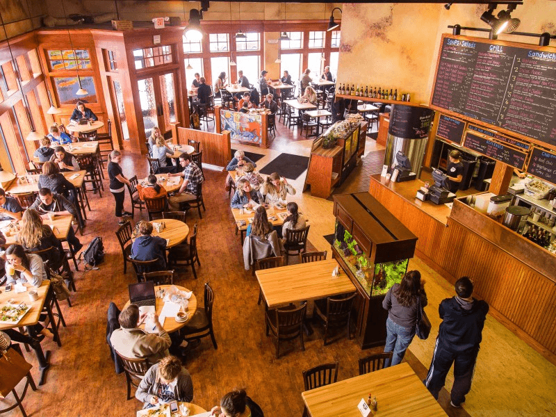
Dog Lane Cafe was a coffeehouse and restaurant local to my alma mater. For my first ever college-level branding project, I was assigned to deliver refreshing new experience for the cafe that resonated with the motto: Come, Sit, Stay.
Rebranding
Inspiration
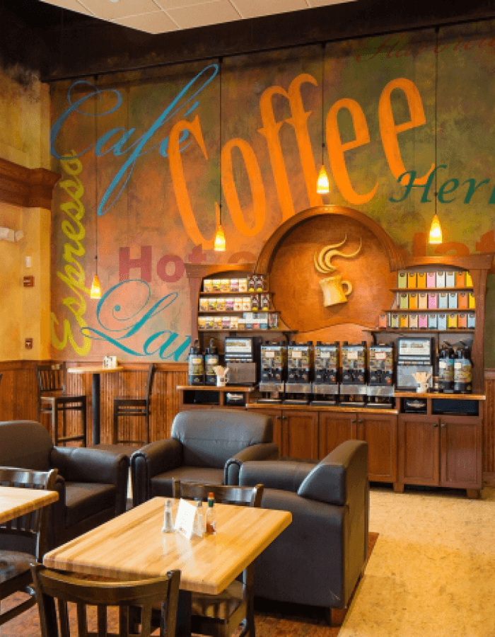
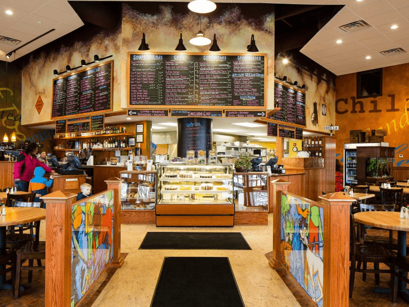
Dog Lane’s current brand experience was too busy. I was inspired by the cozy aesthetic of other coffeehouses, where the dark colors, minimalist designs, and classy experiences evoked feelings of comfort and calmness.

Style Guide
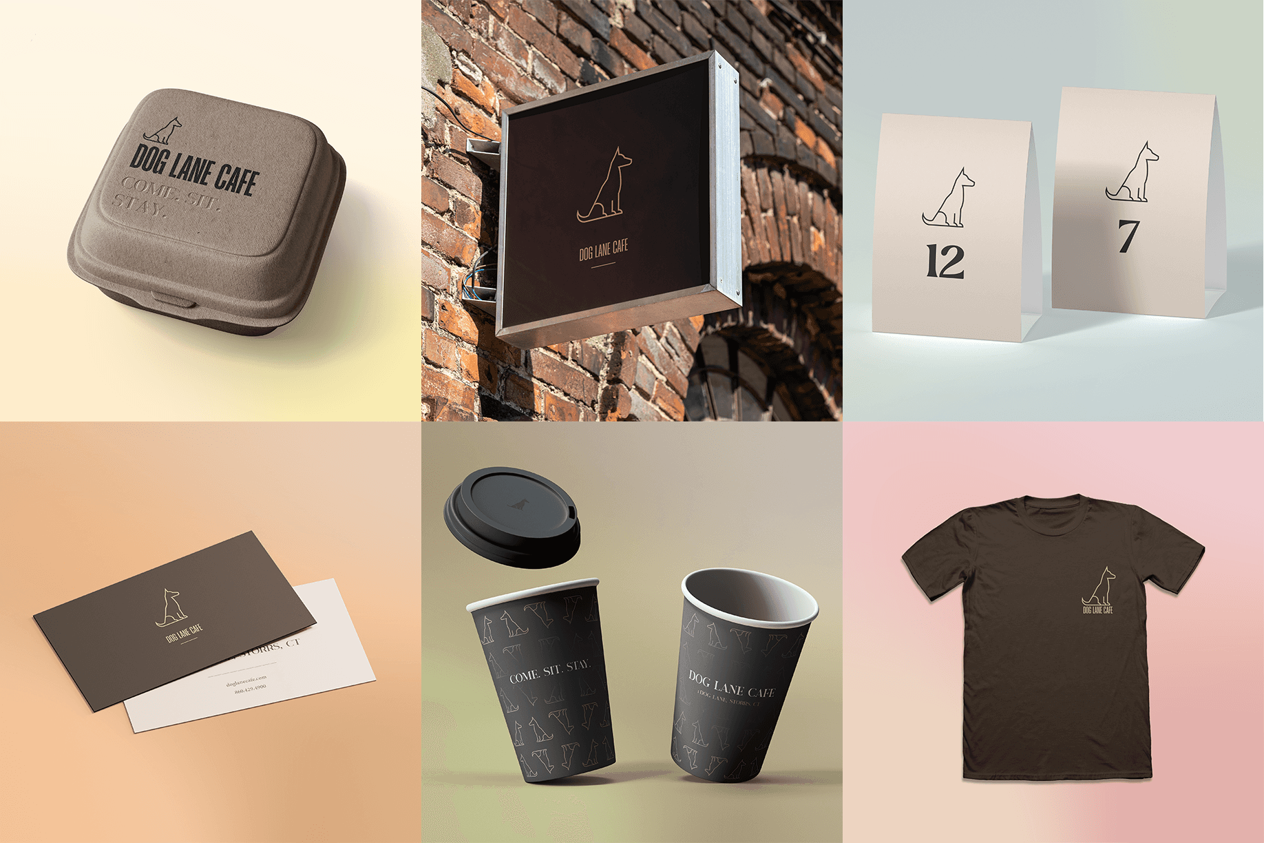
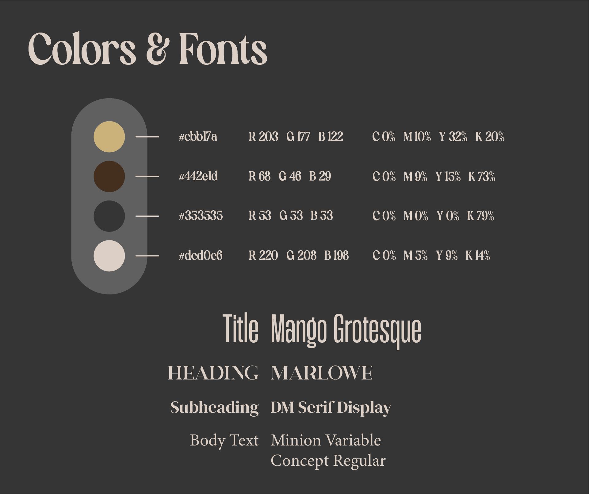
Based on the envisioned aesthetic, I put together a style guide for future designs to draw from. This included a color palette with primary and accent colors, as well as a typography hierarchy.
Logo Design
Dog Lane Cafe lacked a meaningful logo, so I designed a minimalist vector dog; the posture of the logo and manner of the vectors fit the classy, simple experience I was aiming for.

Branding Designs


Mobile App

Style Guide
The style guide for the mobile app differed slightly from the original rebrand because mobile app designs demand different levels of accessibility. In order to stay compliant with readability standards and WCAG, the fonts and colors had to be adjusted.
Page Design
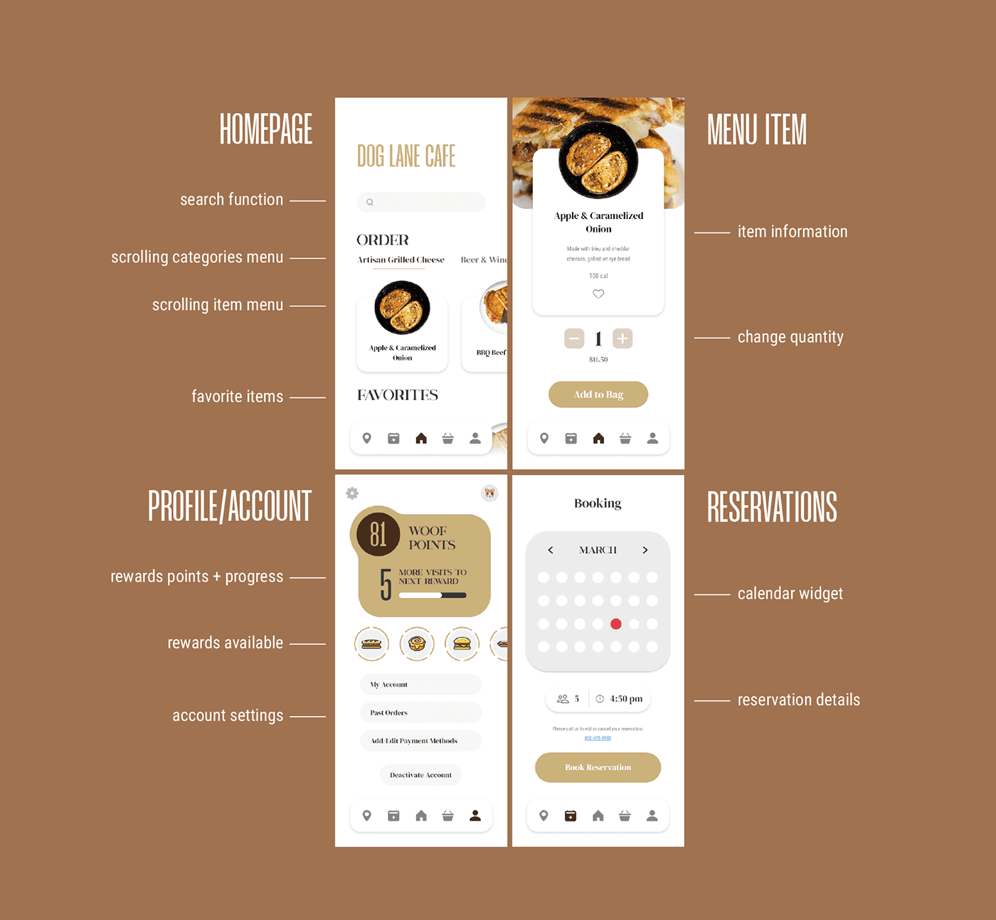
The app’s design is based off traditional mobile ordering services, like Uber Eats and Grubhub. However, since Dog Lane Cafe is also a restaurant, I included reservations, map location, and loyalty program features for an enhanced user experience.
Final Prototype
Home Menu
I created a sleek welcome/load-in animation to immediately establish a 'distinguished' feel to the mobile UX. The home page features the basic offerings of a mobile food ordering app: meals, beverages, and other categories. I included an easily accessible "favorites" section for the regular users, to increase their likelihood of reordering. The food icons were intentionally designed as real photos, as to appeal to the user's appetite.
Searching & Ordering
The search function was placed in an intuitive and primary location, assisted with visual categories to assist the user with their navigation. The ordering pages all feature photos of the food, calories, and a 'favorite' option. These design choices, particularly the consistent use of food photos, optimize the cafe's chances of receiving an order from a browsing user.
Profile & Reservations
The profile page hosts all the typical functions of a user's profile, with the addition of a loyalty program "Dog Tag" that customers can scan and redeem for rewards. The rewards system icons use circular progress bars to motivate customers to make returning purchases at the cafe.
The reservations tab features a minimalist calendar and button function, where users can add their party size and scheduled ETA.
Conclusion & Feedback
This was my first ever project taking an existing brand and readjusting its positioning to better fit its target audience. Both the rebrand and app design allowed me to learn my way through auditing, iterating, and editing together a cohesive customer experience. It was interesting to think at the intersection of marketing principles, user experience, and strategic design to bring this project to life.
Looking back at the designs for both the brand and app, I believe that stronger choices could have been made regarding overall aesthetic approach. The typography and color palette that I used in this project seem a little too stereotypical of a modern coffeehouse, and don't provide much unique character to the cafe. While I still believe the redesign improves the existing customer experience, I wonder if taking a more creative (i.e. UConn-oriented) approach to this project might have special to the local community of students.